Be Plus Be Plus
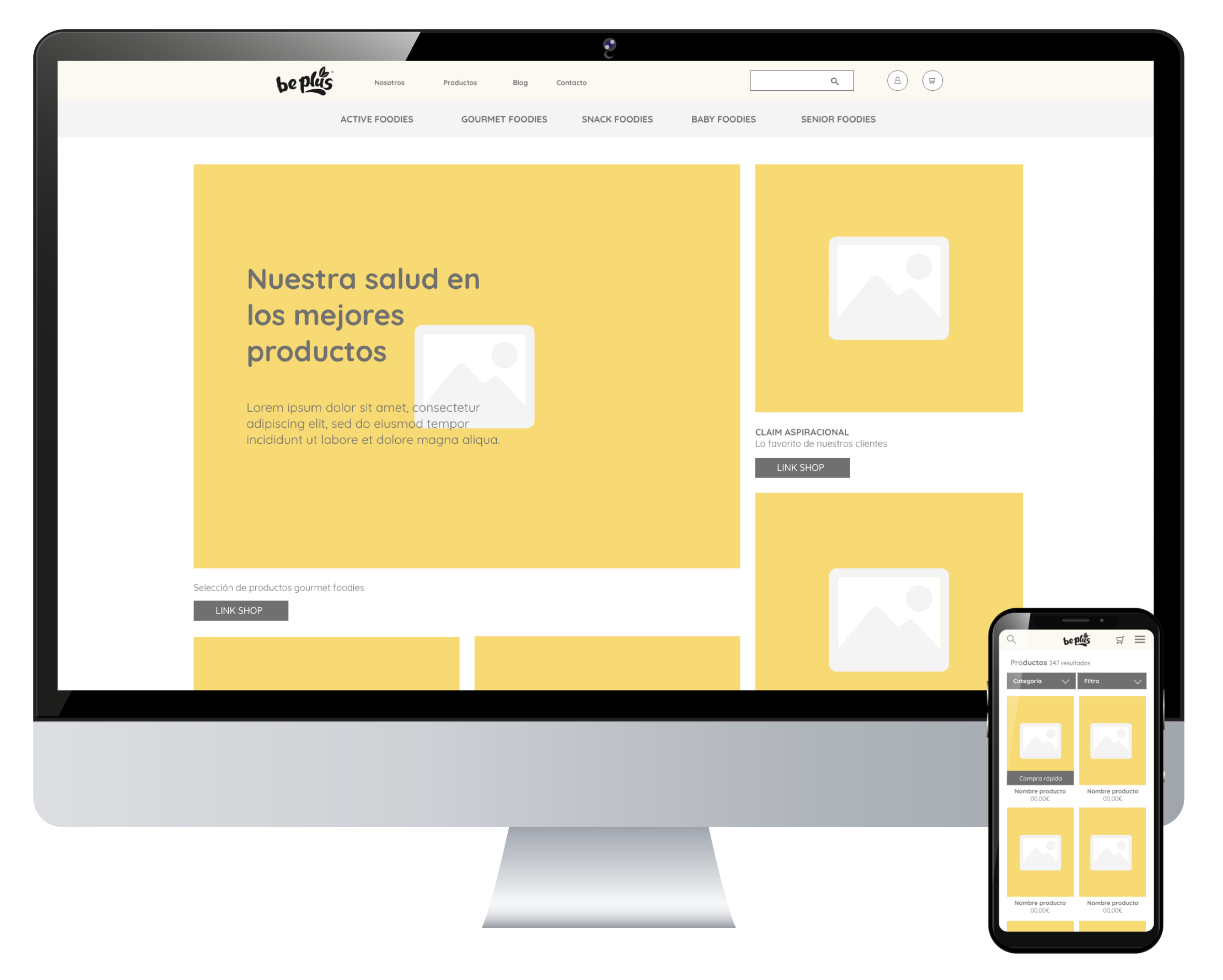
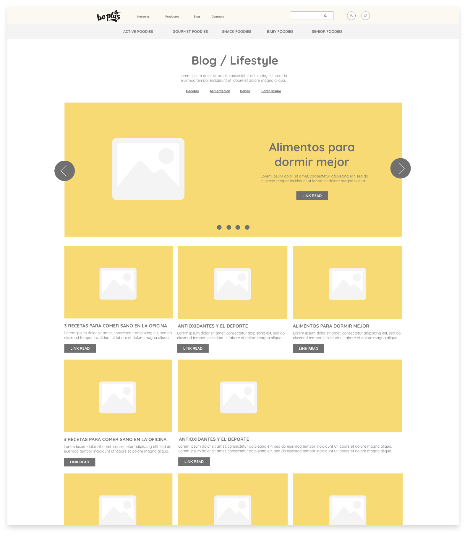
Wireframe design
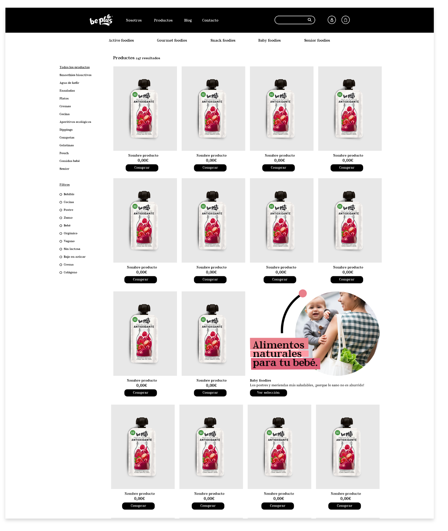
Design of part of the pages
UX menu reorganization
The Be Plus project started with a design request for the web wireframes. The aim was to focus attention on the product and the possibility of online shopping. Until then it was an informative website of the brand. After the closing of the wireframe design, a request was made for the interior page design with the design line already established by the brand.


